Of rainbows, roses and lemons: What symbols and icons can offer public affairs

What do the following have in common?
- The 1950s nuclear disarmament movement in the UK and the 1970s gay rights movement in San Francisco
- Henry VII of England and a modern German automotive manufacturer
- Student protesters in 1960s France and Celtic Football Club’s star striker in 2020
The answer is powerful iconography — everyday symbolism that communicates something complex in a simple, effective, visual way, from emojis to real-world actions, or both, like the raised fists of Black Lives Matter.
This article will explain the nature of these links, using the examples to learn lessons that allow us to formulate a playbook for using iconography in public affairs and advocacy. For those of us working in those fields, there is a wealth of dormant communicative power in icons and symbols.
Lesson 1: Icons don’t need to have clear meaning, but they need to be timely and visually appealing
One of the most ubiquitous icons in the world is the ‘peace sign’. From humble beginnings, it has graduated to become a more political take on the olive branch, and now even has its own emoji in Unicode: ☮
Icons can be powerful symbols of new ideas. We all know what the peace sign means, but what you might not know is that it was originally designed in 1958 for the British Campaign for Nuclear Disarmament. In fact, it was created by placing a C, D and stylised N on top of one another. Now, imagine you are encountering it for the first time. It’s meaning wouldn’t really be clear, would it? If anything, it looks rather like B52 bomber in a circle, ironically (and unintentionally).
However, by creating something visually appealing and distinctive, designer Gerald Holtom helped to define an era. It also helped that he was tapping into the zeitgeist, fulfilling a need where a need existed, and that the image was not copyrighted. It looked nice on flags, on necklaces, on car bumper stickers, and it spread like wildfire.
About 20 years later the rainbow flag emerged in San Francisco and dispersed across the world, also fulfilling a need for a rallying symbol that grew ever more dire as the AIDS epidemic took hold. Each stripe represented something, and, while the aesthetics of the rainbow flag more closely matched its overall message — beautiful, colourful diversity — its granular meaning also wouldn’t have been clear without context, but that didn’t matter.

Icons should represent something, but it is fine if the details need to be explained at first. What is much more important if they are to catch on in the public consciousness is that they help communicate a complex idea that matters to people, that they look good and that end users can easily reproduce them and adapt them for their own purposes.
Lesson 2: Icons can borrow from existing symbolism to create a new message
One of the earliest examples of conscious political branding comes immediately after the English Wars of the Roses, fought from 1455 until 1485. The opposing Houses of Lancaster and York swapped the throne four times before the wars were concluded, establishing a lineage that would last for 120 years. The conflict and its protagonists inspired prominent works of anglophone literature from four plays of Shakespeare to Game of Thrones. But no-one in the 15th Century would have recognised their name at the time.
The wars ended when Henry VII of Lancaster returned from exile to kill the Yorkist king Richard III and take the throne by force. The problem was, he was not a direct descendant of the last Lancaster monarch. The country was divided and full of enemies, and many doubted his claim to the throne. Although he chose to marry the female heir of a previous Yorkist king, he needed something more to cement his support. He turned to iconography.
Buried deep within the rich heraldry of the two rival houses, the new king found two similar but rarely used symbols, the red rose of Lancaster and the white rose of York. He amalgamated them into the red-and-white Tudor rose and launched the new House of Tudor. The branding masterstroke brought together two minor icons to create a something new that told a powerful story with an important secondary message:
This is a new era of reconciliation and unity, and my heir is the heir of both houses.
His eventual heir, Henry VIII, was fully aware of the importance of the Tudor rose to his reign, placing it everywhere royal iconography reached. To this day, it can still be easily found on the coat of arms of the British royal family, British currency, and the badge of the Supreme Court of the United Kingdom, to name just a few places.

But what has this got to do with a German automotive manufacturer?
Lesson 3: The best icons are simple by design and persistent by nature
In 1932, Auto Union AG was created via an amalgamation of four carmakers struggling to survive through recession. Like Henry VII, the new company needed to tell a story of unification that would convince the doubters and signal the beginning of a new era. The result was an unpretentious, trustworthy logo of four interlocking rings arranged in a row, one for each of the predecessor companies. You will recognise it as the Audi logo today.
Whether or not the design intentionally borrowed prestige from the Olympics (coming to town four years later) by mimicking their five interlocking rings is a matter for debate. So much so, that the International Olympic Committee took Audi to international trademark court over the matter 63 years later (Audi won). What can’t be disputed is that the company chose an icon that told the right story at the right time, and evolved in the public consciousness into one of the most recognisable and easy-to-recall logos in the world.
Lesson 4: We will always use icons
This brings us to the final, fascinating example: how the lemon emoji came to represent the star striker for the Glasgow-based Celtic FC, the team I follow.
You might assume the player himself has a predilection for lemons or wearing the colour yellow, or that the fruit has a connection with French Guiana, his place of origin. But the story actually begins elsewhere on French territory, in May 1968.
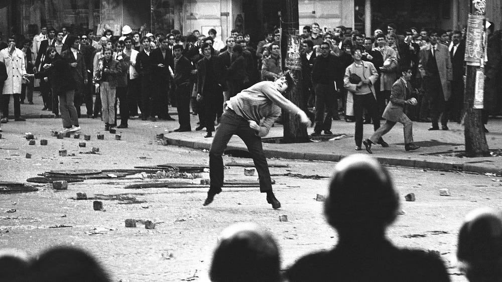
A dispute between university authorities and students on the Nanterre campus of the University of Paris escalated into clashes with police after an administrative building was occupied. This quickly morphed into a nationwide revolt against the capitalism, imperialism and traditional institutions that were embodied by President Charles De Gaulle. The unrest was so serious that De Gaulle fled to Germany at one point without telling his government where he was going — and brought his family jewels with him fearing they would be lost in a socialist coup d’état.

The lemon symbolised none of this until a chance encounter in the 1980s between a veteran of the riots, hitchhiking through Europe, and a young man from Manchester. Ian Brown learned of how the protesters, under assault from the acrid smoke of tear gas, would neutralise the worst effects by sucking on slices of lemon. (During the recent Black Lives Matter protests, Amnesty International was advising protesters to carry bandanas soaked in lemon juice for the same reason.)
To Brown, the lemon analogy conjured images of idealistic youth facing down aggressive, well-equipped police using whatever they could find to hand. It said something about their strength of character and the depth of their beliefs, as well as the power dynamics and political urgency of the time. Knowing that the protests happened is educational. Knowing about the lemons makes it visceral, memorable, and emotional.

Brown incorporated lyrics about “citrus-sucking sunshine” onto the Stone Roses seminal debut album, and the album’s cover was adorned with a French Tricolore and slices of lemon, which became something of a logo for the band.
Cut to three decades later, and a young French striker is making waves in Glasgow. An adapted version of I Wanna Be Adored, which opens the album, becomes Odsonne Edouard’s terrace anthem (“I wanna be Edouard” being the altered lyrics). Looking for new ways to express their love for him on social media, the fans turn to the iconic album cover and settle not on the Tricolore, but on the lemons.
What this demonstrates, more than the other examples, is our need to use iconography. As a species, we began communicating through simple pictorial means. Icons are part of us, and we will always find ways to use them.
The abstraction icons provide is a feature, not a bug, because it provides a way to communicate the broader and evolving nuances of political and social messages more effectively than words and slogans ever could.
Lesson 5: Icons in today’s policy environment
For those working in public affairs in Brussels, like me, or elsewhere, icons have one obvious advantage — they are translatable, but personal. Take the peace sign and the rainbow flag. Everyone in Europe understands the meaning of these icons. This is all the more remarkable when you consider that if you asked every European what they mean, you would get millions of slightly different answers.
Politically, the most vibrant uptake of iconography is seen in organic grassroots politics, but emojis are increasingly being deployed in diplomacy. Innovations aren’t just happening on social media, either. The yellow ribbon has symbolised conflict between Spain’s central government and the separatists of Catalonia since it appeared in the Catalan parliament in 2018, while pig-tailed Greta Thunberg has become a living icon for environmentalism.
Despite this, few of us working in Brussels feel inclined to incorporate these visual ideas into our communications work in a strategic way. We limit ourselves to including the recycling emoji when tweeting about circularity or placing the factory emoji if our LinkedIn post mentions the Industrial Strategy. This should change; we should evolve our thinking.
The iconography playbook
If you are convinced, or at least want to experiment with this idea, this is a checklist of points to think about based on the examples already highlighted.
When developing or choosing an icon:
- It should solve a communications problem. Look for moments when a message is both highly relevant to public discussion and difficult to get across.
- Think about the deeper story that it tells, like the lemons.
- Consider (but don’t be overly afraid of) the potential for miscommunication or conflation with other symbols.
- It should be visually appealing. Even better if it is notable or remarkable some way, so that it sparks interest on its own terms.
- It should be simple — easy to recall, replicate and adapt, like the Audi logo.
- It should be untrademarked so that end users can adapt it to their own purposes. Icons symbolise ideas, so unless it is your logo, you don’t own it.
- As a bonus, make it one of the 1,809 icons on the Unicode list of emojis, to maximise shareability.
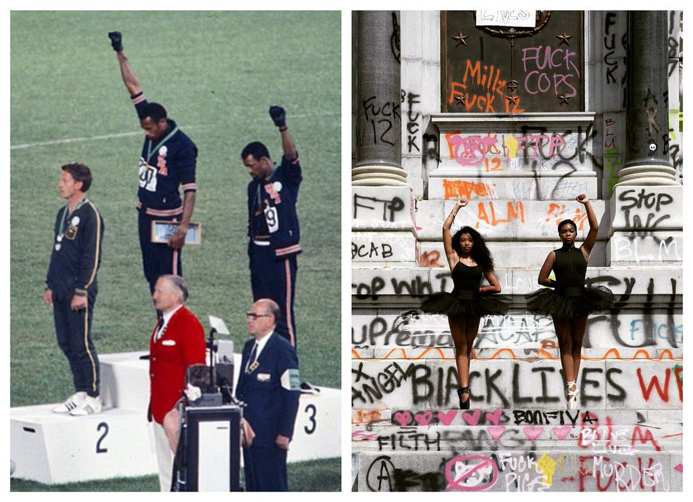
As well as the student protests in Paris, 1968 saw two black American athletes, Tommie Smith and John Carlos, raising their fists on the podium for the 200 metre sprint race at the Summer Olympics. 2020 sees that famous image echoed in Richmond, Virginia, as two ballerinas reclaim the monument to Confederate general Robert E. Lee.

Twitter has set the time limit on the #BlackLivesMatter emoji to the year 3000. As raised fists proliferate once more, it is time we recognise the enduring power of iconography in the public space.
